This one goes out to all you authors who’ve had to send PR photos or copies of your book covers in for a brochure, poster or a print publication of any kind – and stopped to wonder if the picture was big enough, high enough resolution or how you even judge these things.
And it seems that a lot of people are still wondering about this stuff.
I still take on the odd design job from time to time, and having just finished a festival brochure that required images from every performer involved, I thought I’d fill you in on the kind of thing that drives designers and printers BANANAS. I say this, not just for the sake of stressed designers everywhere, but because while there are some who will chase you for a decent image if you haven’t provided one, there are many more who won’t, because that’s time they don’t get paid for.
And this could be your face or your book cover we’re talking about here.
Let’s look at it from a purely self-serving perspective first. Like it or not, we’re in the publicity game, people. That image might be the first time anyone sets eyes on you or your work, so you want to make a good impression. Your author photo should make you look interesting and approachable, you should be recognizable from your photo . . . you should be in focus. If it’s a book cover, it should be clear, readable and striking – assuming your cover designer did their job right.
Assuming that you have decent images of yourself and your book, let’s proceed to what kind of file you send out for what purpose. For a start, I want to talk about the difference between size and resolution.
This can be complicated stuff (at least, I find it complicated), but I’ll try and boil it down as best I can.
Resolution: Pixels Per Inch – The Level of Detail
Digital images on screen and in print are not solid swathes of colour, they’re made up of tiny dots. The key difference between images shown on a screen and images in print is the nature of the dots that make up that picture. On the screen, they are glowing points of light in a grid – pixels. Lean in closer to your screen and have a look those sweet little cuties. Photo software tends to have a default setting of 72 ppi (pixels per inch). The fact that they’re made of light makes them all blend together smoothly.
Sometimes you see people using ‘dpi’ (dots per inch), because we were already using dots in printing when the process went digital things got confusing, but ‘dpi’ refers specifically to print.
The dots used to print an image are a different type and they don’t glow – they’re just ink, after all – but they combine to create the illusion of a solid colour. That size and number can vary depending on the type of printing and the paper, the ink etc.
So, to recap, the pictures on your screen are made up of dots. And anything that’s printed is also made up of dots.
The bad news is, they are not the same types of dots – you have to treat the two types differently.
The good news is, unless you work in the print business, this is not your problem.
The images you provide to other people are made up of pixels. That’s what you need to know. The dots with which they’ll be printed are the printer’s problem (whether that’s the device or the profession).
This ppi business onscreen is referred to as ‘resolution’. It’s crucial when it comes to referring to the quality of an image.
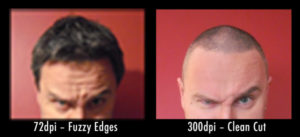
If a printing process used only 72 pixels per inch, the dots would be clearly visible. It would look like a pointillist picture. Even your simple desktop printer prints at a much higher quality than this. Ever noticed how an image off the web looks okay on screen, but prints out looking like blurred mush? The reason for that is that you’ve taken one load of dots, and tried to recreate it with another, completely different set of dots.
The way you can compensate for this is to have your original image in a much denser, finer, more detailed form before you take it to print. It has to be a higher resolution.
In the print business, we generally look for images that have a resolution of 300 ppi.  Most illustrations would be supplied at this resolution – but they can also be much higher, depending on how they’re being printed. And at 300 ppi, you have to look really, really close to see those dots. That density also means that the dots can describe much finer detail. If you have two different photos that are the same area, one saved at 72 ppi and one at 300 ppi, the 300 ppi one will be a substantially bigger file because it has much more detail – more information.
All You Need to Remember About Resolution: So when we’re talking about resolution, we mean the amount of fine detail a picture can show. There are just two types you need to remember: 72 ppi might be okay if you only want to look at it onscreen, but we need 300 ppi for something that you’re using for print.
On a loosely related storytelling note, you know how you see in all these cop programmes where they have a digital photo and they ‘enhance the image’ to get a better look at it? This is largely bullshit. You’re looking at a grid of pixels. The computer can’t zoom in there and find more detail. There isn’t any. It’s just pixels. You used to be able to do this with film up to a point, but a digital photo is a grid of coloured squares. Once you start tweaking the picture, you’re changing the information in it, not finding more.
Anyway, let’s talk about size. Although actually there are two types of size. There’s the area of the picture, the physical measurements, and the file size, the amount of memory needed to store it.
Let’s look at area first:
Area: Length and Width of the Printed Picture
Your digital camera saves every photo at 72 ppi – the default screen resolution, which seems like low quality, but those pictures will typically be very large in area. We tend to think of digital photos as the traditional 6 x 4 inch kind of thing, when in fact a normal camera might take images that would comfortably fill an A4 page or larger.
These dimensions are the actual ‘size’ of the photo – the area it covers – as opposed to the ‘resolution’. A low resolution file saved as a large image can be printed as a smaller, higher quality image. You can condense it down. It may be low resolution, but because of its size, there’s lots of detail there.
But if you try to increase the size of the picture with image software, you don’t get any more detail – you just spread everything out. There is no ‘enhancing’ the detail. A designer will always prefer a picture that’s bigger than they need, to one that’s smaller. They can take a large 72 ppi picture and drop it into a 300 ppi file to create a small, high quality image. It doesn’t work the other way around.
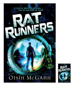
 The picture here shows what happens when you drop a 72 ppi image into a 300 ppi file. Both of these images actually have the same dimensions, but the one on the left is the resolution you need to print the cover out at its actual size.
The 72 ppi image is so much smaller, because when you put them side by side in the same window, the image software shows their size according to the number of pixels each one has. So even though they would have the same dimensions if printed out, the one on the left has far more detail. See why designers get pissed off with small files?
All You Need to Remember About Area: The dimensions are the physical size, the area, of the picture, as opposed to resolution, which is the number of pixels and capacity for detail within it. Both of these elements together decide how much information is in the picture. It is the amount of information that affects the file size of your image.
File Size: The Amount of Memory Needed to Store Your Image
A rough idea of the quality of an image can be judged by looking at the file size. An A5 book cover at 300 ppi might be 15 or 20 megabytes. The same image at A4 might be 30 megabytes. These big sizes are heavy on memory, but a compressed file such as a jpeg – everyone uses jpegs, they’re like the MP3 of the image world – could reduce the storage size of that A5 file to 3 megabytes (it still kind of ‘unfolds’ to the full 15 or 20 megabytes when you’re using it).
However, that same image at a resolution of 72 ppi will be less than a megabyte in size – because it has less than a third of the information of the print-quality file. It’s made up of fewer dots or pixels.
And that’s just fine if you’re only putting it on the web (it might be relatively huge), but if you’re sending a book cover to a designer and it’s less than a megabyte, it’s not a file you could use to print your cover at its actual size – it has been reduced.
This is something to watch out for if you’re an author, as publishers don’t tend to send authors print quality files of their own covers. They keep a tight hold of the good stuff. Yours is most likely a reduced version, which might be fine for PR purposes, say a small inset pic in an article or brochure, but will be useless for a poster.
All You Need to Remember About File Size: The file size is dictated by the amount of information, which in turn is determined by a picture’s dimensions (area) and the amount of detail it can show (resolution). The file size is a quick, but by no means foolproof, means of judging the quality of your image. After all, it might have plenty of detail, but still be a rubbish-looking picture. But if the picture’s okay, and the file is a reasonable size, you know you’re pretty safe.
In a Nutshell
If you’re putting something up on the web, an image that looks okay on screen at 72 ppi probably is fine. If you’re sending something to a printed publication, a decent 300 ppi image or a big 72 ppi image is probably needed. Don’t ask a designer working on a print job to ‘just pull an image off the web’. This is lazy, unhelpful, self-defeating and is showing your ignorance.
Bear in mind that if they’re using images to make an attractive feature in their brochure/article/poster, they’ll do it with whatever high res images they have. If yours is a decent image, it’s more likely to be used to greater effect. If your image is crap quality, they might not even put it in.
Every chance to have a visual reminder of you or your work published is an opportunity to promote yourself. If someone asks you to send images for a brochure or article you’re playing a part in, send them high quality pictures, send them more than one and send them promptly.
Get the designer on your side and he or she is more likely to put your pics front and centre, where you want them to be.

Brilliant post, Oisin. I’ve shared this with my fellow technical writers at work because we have to deal with this issue all the time when the engineers send us images that are too small or too low res. We mostly write for online viewing but the files also have to be printable. The “All you need to remember” sections are perfect. Thanks! Colleen 🙂
Glad it’s useful, Colleen.
Thanks for the comment Derek, and you’re right of course. The resolution you want to display an image depends on the size you want to display (or print) it at. The points made on the site are all very good . . . but very *technical* and offer too many variations to be practical for people who just want to send a picture to a designer. And most of those people just won’t read long-winded explanations and actually all I want is for them to understand ‘low res’ versus ‘high res’ in simple terms so they won’t send designers stuff that’s too small to print. Being right, but very detailed, in your definition won’t get the message through to people. Unfortunately, being simplistic often gets the job done better.
Yes, thank you. My concern is that people persist in sending designers files that are too low quality to print and so I’m keeping the options as simple as I can – even if it means it’s failing to present the myriad of actual variations that can be used. I’m sorry that you feel simple or detailed doesn’t matter in getting people to take that information in. If they need more information, they can follow your link. Good luck with your campaign.