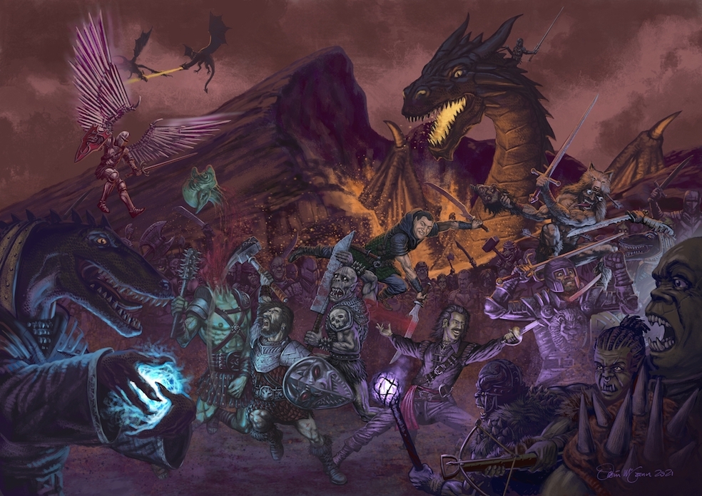
This is a painting I did last year, commissioned by my brother Marek and a few of his gamer mates, in honour of the longest RPG campaign they ever ran. I’ve done a few paintings for them over the years, and they’re always fun, giving me the chance to stretch myself in ways that I don’t often get on other work.

This was a first for me, in that I didn’t work out the full composition on paper first, and only did some very rough sketches for the main figures. I’ve been using Krita for the last few years, an alternative to Photoshop, and I wanted to play around with the paint tools and experiment a lot with it. It was going to be a very complicated layout, but with no firm deadline, I was able to take my time with this job.
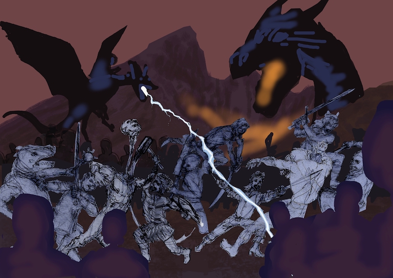
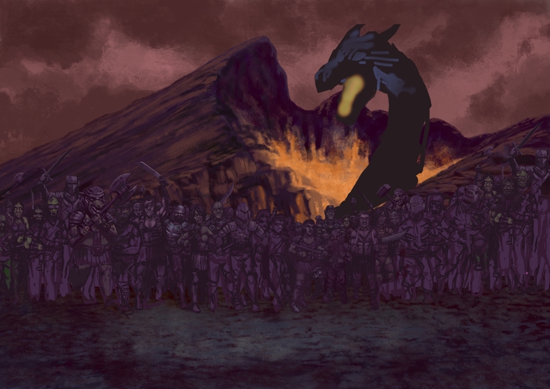
The first stage (below) involved dropping the middle-ground figures – the main characters and their opponents – into a composition blocked out in simple colours, just to get the positions. In this original concept, I had two dragons, one small one on the left and the giant one on the right. The small one could shoot lightning. The character sketches, the foreground silhouettes, the dragons, the mountain background and the sky were all on separate layers.
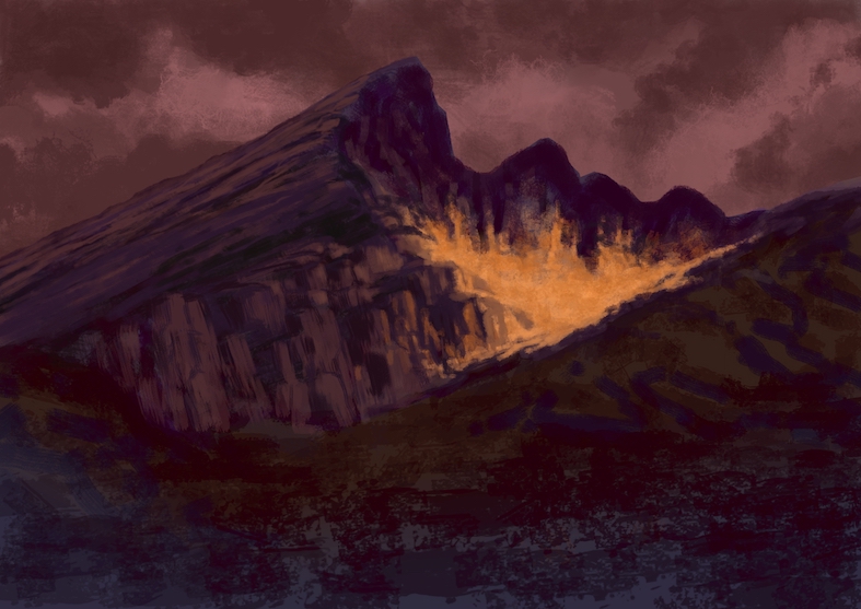
Once I had everything in the positions I wanted (or so I thought at the time), I hid all the characters and painted up the background, bar the main highlights in the flames, which were to come later. I wanted to suggest a big hollow in the mountain where the big guy was going to stick his head out. I was laying a base of dark, earthy tones; lighter browns and reds towards the back, darker purples towards the front.
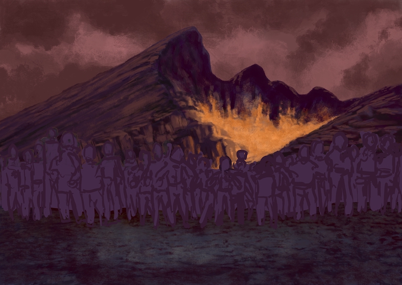
Next came the roughing out of the background figures, and the texture of the ground for the main stage. As you can see, I was still keeping it fairly simple with the figures, varying sizes and shapes before adding any details. The idea was that they’d form the background in the battle, the back wall of the stage where I’d be putting my main characters, so they had to stay pretty dark and not clutter the image too much. Even so, I wanted to make the most of these, and have each one as an individual, even if they were only going to make up numbers in the battle to come.
Then I started working into them, adding details. I had to keep switching the main characters layer on and off so that I wasn’t adding detail where it wasn’t needed – avoiding wasted effort because it would be covered up (the blessing and curse of working in layers). You’ll notice a few characters on the left show up again on the right. I copied them over when I realized they’d be covered up when I made some changes to the fore- and middle-ground characters.
The trick here was to have fun with the details, while still keeping them knocked back enough so that the characters looked like part of the battle, without overpowering the main figures. The first version of the giant dragon was just too big, so I reduced it and extended the neck. I tend to render the less important stuff first, if I can, because I like to keep my favourite bits until the end.
Next, I worked up the foreground characters, which was nice, as I was finally getting to play with some close-up character detail. These were still dark, but with a different tone to the background characters and some hard edge-lights to define the shapes, so they’d frame the main action, helping create a feeling of depth. This also introduced the two brightest light sources for the main stage. The smaller dragon on the left came out at this point, as one of the main characters could create wings from fallen weapons and Marek asked if I could include this. That meant pushing the character into the background to give him room, and lifting him up into the sky. To compensate for the loss of a dragon, I put two smaller ones battling in the sky on the other side, and started rendering the big boy.
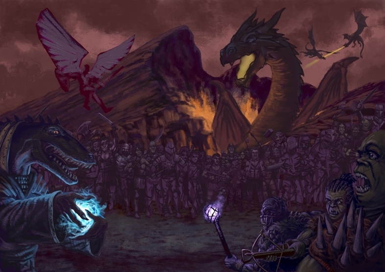
With the big dragon completed, I had a better idea of where to finish off the highlights on the background figures. Given how the main characters were going to be laid out, the composition was getting pretty crowded on the right. I wanted to balance it out a bit more, so I decided to move those background dragons to the other side. This is the joy of using layers; when a composition needs changing, you can just move the different elements around. Layers are the business. You do have to control how you use them though, as every extra layer adds to the memory you’re using, and on a big file like this, if it gets overloaded, the rendering can get very slow, or the programme can crash altogether.
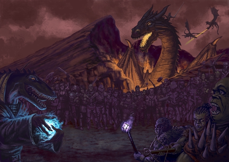
The biggest challenge with this composition was that each main character represented a gamer, so they had to have about equal weight in the picture, which is not normally how you lay things out. Usually, you want to draw the eye to a certain place in the image, using one, two or maybe three points of focus at the most. Instead, I was aiming to create the sense of a furious battle, guiding the eye from the top left corner (where Western readers normally start looking), swooping down and then up to the right. Each character had to have a distinctive appearance, and even fighting style, which I tried to capture. This was one of the most detailed paintings I’ve ever done, and was great craic to work on, but because I was experimenting a lot, it took AGES.
Hope you like it.