I still take on illustration jobs and private commissions, but it’s rare enough that I get the time to do some decent painting, so when a guy I owed a big favour to asked me to do an A3 poster of a role-playing game he’d run with his mates, based in the Star Wars universe, I thought I’d record the process. If you’re into illustration – either doing it or just looking at it – you might find this interesting.
If I was doing a painting to be printed A4, I’d probably work at A3, though it can vary. For best results, it’s always a good idea to start any painting with some decent reference photos and a lot of sketching, but I had to plunge straight in with this one after a minimum of preparatory sketches. Also, one of the problems with working in different styles, is that it takes time to get up to speed when you switch from one style to another. I hadn’t done something like this in a while, so this picture took about four days to do, from the first sketch to the point when I cut it off the board. Someone who works in this kind of style all the time could probably cut that time down substantially.
I always start a picture by doing a thumbnail sketch, drawing very loosely to map out the composition – setting out where all the pieces of the picture have to go, and what size they’ll be. 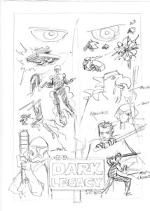 This is a stage that normally won’t be seen by anyone but me, so it’s little more than a scribble, but it’s a vital stage nonetheless, as I don’t want to be moving big elements around once I start fiddling with details. This is a complicated composition, as there are a lot of distinctive characters which all have to feature. What’s even harder, is that the focus can’t be on any one character, as they all represent players, so each one has to be given a decent position.
Normally in a picture, you’d have a few key elements that attract the eye, and everything else would be placed around these in secondary positions.
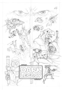 After the thumbnail comes the finished pencil drawing. Now I have to work the details out properly – I’ve been given a lot of pictures to help to describe the characters and the ships, but none that can be used as direct references; they all have to be changed to match the brief for the picture. This stage takes a lot more time – in this case, the best part of a day. I’m not too concerned with shading yet, if I’m going to be using a heavy painting style, as I will here. But I will normally give myself some indication of the direction of light. This picture is going to be absolutely filled with light sources, so there’s no real point worrying about shading at this point. As you’ll see with the next part, I’ll be painting over everything first anyway.
I create the logo in Photoshop and trace it off. I could do it freehand, if I wanted to give myself a real headache, but there’s no need. This is being hung as a painting, however, rather than printed as an illustration, so I will be painting the logo into the picture. If this were an illustration job, I’d place the logo in using Photoshop or Illustrator after I’d scanned in the final picture. The Star Wars font, as I’ve discovered, is a bit of an ugly sucker, and I’m having my doubts about using it for the main title – the bit on the frame looks okay. Also, having that ‘A’ in ‘A Dark Legacy’ (notice the change from the first pencil) throws off the composition, but that was the title of the game, so that ‘A’ has got to go in.
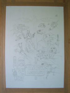 After I’ve done the pencil drawing, I’ll scan it in and email it off to the client to make sure everything’s the way they want it. If there are any changes, I want to do them at this stage – it’s a lot easier to change a pencil drawing rather than a painting. As it turns out, there was one change that came a bit late, but not a major one. If you can see the character with the beak halfway on the right-hand side, his beak needed to be closed, which only came up after I’d done the first wash. That’s the kind of thing that’s much easier to change in pencil than with paint.
After I’ve got the all clear to to start painting, I draw the picture again – onto a heavy painting paper this time – by tracing it using a light-box. If the paper’s very heavy, or your layers of paint hide too much of the linework, you need to use transfer paper or the like to copy down the drawing a piece at a time.
With the drawing done onto the painting paper, I then stretch the paper, by wetting it so that it swells – and often buckles – and then taping the edges down with a gum-paper tape. As the paper dries, it contracts again until it’s perfectly flat and can then be wet with paint without fear that it’s going to buckle or curl again. 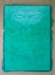 This is the way I work; other artists will use card so thick that it doesn’t buckle at all, but you can’t trace through that stuff. You have to mark the drawing onto the card using a copy of your drawing and transfer paper. Don’t mind the distortion in the photo that makes the edges look like they’re bending – that’s down to the slight fish-eye effect of the lens of of my camera. It’s just not made for photographing this kind of stuff. Something I’ll have to sort at a later date.
After the paper has dried and flattened out (a hairdryer can speed the process up a bit), I lay down the first few washes of background colour with a large flat brush. I start with a strong green, then gradually add black and blue to the green paint as I go. I’m using acrylic here, which won’t budge too much once it’s dry. Gouache will cover better and give a flatter colour, but it can lift back up when you lay another layer of paint over it. Sometimes that’s a good thing, but I want a solid base here.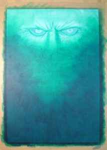
The area around the eyes at the top of the picture is the only part that will be painted using a light style (painting with light washes, then gradually getting darker, as if I was using watercolour). For most of this picture, I’ll lay down the dark colours first and then paint lighter colours on top. This is where you really need to have a clear image in your head of what your end result will be, because you have to hide a lot of your drawing under these washes before you bring it out again. If you were inclined to worrying that you were going to cock things up while painting, this is where you’d be getting butterflies in your tummy.
The darker and heavier you go with the paint, the more you lose of your drawing, so either you reinforce your drawing as you go, or you draw it on again afterward. In this case, once I’ve laid down the darkest washes, I go over a lot of the linework with some thinned down black acrylic, to make the drawing more visible again. I also do some of the finer work around the eyes, with the same shades that I use for the washes. It’s at this point I’m starting to curse the slightly weird, square proportions of that Star Wars font. I should have used something else, but I’ve committed, so to hell with it.
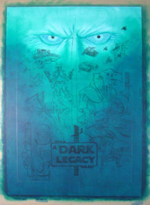 Now is the time to start thinking seriously about where the light is coming from for each element of the picture, as this will dictate how I paint the lighter shades of colour, and where I can put down darker shadows. There will be a lot of different colours, but I want to keep some of this blue-green in the shadows of each element wherever possible, to help hold the picture together.
As I said, you need a strong sense of what your picture is going to look like at the end. If I had photos as direct references for all of these elements, this would be a lot easier. Anyone doing a real film poster would have plenty of stills to work from, but it would take ages to set up and shoot all the pictures I’d need – not to mention the expense of models and props – so I’m pretty much doing this all from my head at this stage.
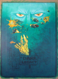 Whenever possible, it’s best to work from the top left corner down – if you’re right-handed – so you’re not reaching across your finished work too often. It’s also the direction your eye takes across the page, because of the way we read, at least in English-speaking and European cultures. I paint in the lighter parts of those eyes, the spaceships at the top, the explosions and the blast from the jet-pack on the Boba Fett lookalike. There’s also a malevolent figure emerging from the flames in the middle there. These elements are now pretty finished, but there’ll be some retouching later as I go back around for another pass when I’ve got more of the picture done. While I’ve got some yellow on my brush, I do a few of the Fett character’s pieces of armour that are the same colour too.
Then I paint the remaining figures on the left side, again, trying to keep a hint of that green in the shadows wherever possible. It unifies what is otherwise quite a scattered composition. 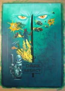 The black ‘darksaber’ in the middle of the picture acts as a mast, which helps too. I’ve got to add markings to the blade and a bit of a glow, but basically it’s little more than a flat black area running up through the centre. That character in the flames is now reaching out for the jedi who’s leaping away from him. Notice that the armoured figure beneath them is all brushed steel at the moment; that’ll change on another pass. I think I’ve made him a little too folded up, I should probably have done him further into the foreground, but his light-coloured armour would have overpowered the light from the all the flames and lightsabers.
I had originally intended to have stars in the background, at least behind the ships, but the picture’s so busy already, I decide to leave them out. With so many sources of light, I need as many dark areas as possible for contrast.
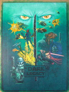 Now I finish off the darksaber, add some shadows to the eyes at the top, and go to work on the figures on the right-hand side. The character with the beak now has his beak closed. He is an old, wise character, in contrast to the young swordsman below him (the blue-tinged character between them is a ghost-like mentor for the younger one). The different lighting of these two characters reflects their two roles, but it’s only after I’ve done the younger man’s lightsaber red, that I realize it’s supposed to be blue. This changes not only the sword itself, but also the highlights on the character’s face, hands and clothes. As I’m using a heavy painting style, this isn’t a major problem. If I was painting with watercolour, with loads of translucent layers making up the dark shades, it would be.
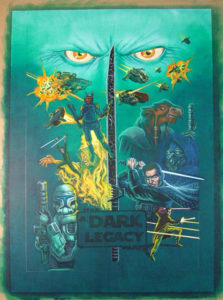 I change that red light to blue. I also give the armoured figure in the bottom left corner a green tinge, and paint in some yellow highlights to tie him into the picture around him a bit more. The final figure in the bottom right corner is in an action pose, deflecting a shot from a blaster with his hand, jedi-style. As with the jumping figure on the other side, to show his full body, I have to show him much smaller in comparison to the other figures. This also gives the composition a bit more variation and balance.
All the most enjoyable stuff is done now. This has been a fun job – I haven’t drawn Star Wars stuff since I was a kid. At this point, I’m going back over things, strengthening shadows, defining the odd detail a bit better, doing what I can to pull the whole picture together . . . and anticipating doing that logo. Lettering is always tricky when you’re painting, and this square font is unusual; the weight is even through the curves and yet some of the letters are designed to join up, while others aren’t. Oh, and I’m trying to give it a kind of fiery gold effect, an uneven colour that makes keeping the edges even all the more interesting.
It’s not long before I’m really starting to hate this bloody font.
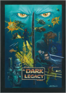 I finish up by painting a black frame all the way round, its edge broken only by the blue lightsaber on the right. As is the case with any illustration larger than A4 that I do on the drawing board, I can’t scan it myself. So I have to take it to a place in Dublin to be scanned. If this was a job for print, I’d then do a bit of retouching before I send it to the client – I do a bit on this scan anyway, even though the original will have to stand as it is.
Though I work a lot in Photoshop, I haven’t quite switched to doing painting digitally, and part of me will never want to, even though it makes sense for commercial illustration. The software is getting better all the time too, although a lot of digital painting still looks a bit too greasy or plasticky for my tastes. But there’s no getting round the fact that, soon the day will come when work restraints will mean taking the painting onto the screen, switching my pencils, paintbrushes and paper for a stylus and tablet. I do have to admit to being sorely tempted by the prospect of being able to back artwork up as I go, to play with textures and photos, and being able to hit ‘Undo’, when I cock things up. But you can’t feel graphics under your fingertips, or smell the colour as you mix it, or see the textures and sheens of the different types of paint, see the sweep or stipple of the brush in the surface. Do your work onscreen, and you’ll never be able to hold the original in you hands.
Back when I made my living entirely from illustration, there were some jobs I just didn’t care that much about – I did them to pay the bills. That kind of stuff I’d happily do on the computer. But though the phrase might seem trite, with very few exceptions that I’ve seen, digital painting has no soul.
And I say that in the full knowledge that I’ve just produced what amounts to fan art of the world’s biggest entertainment franchise (or is that Disney?). I do other stuff too. It’s just that I haven’t spent most of my life learning how to paint (and as you can see, I still have a lot to learn), to see that work in a printout. So, wherever possible, I say: Keep it live. Keep it messy. Keep it real.
